


Your Instagram feed is often the first thing people see when they visit your profile. In just a few seconds, they decide whether to follow you, scroll through your content, or move on. A well-crafted Instagram feed tells a story, creates a mood, and invites people to stay a while.
Building an Instagram feed that people actually want to scroll through takes more than just posting pretty pictures. It requires thought, planning, and a clear understanding of what makes content visually appealing. The good news is that anyone can create a scroll-worthy feed with the right approach and a bit of consistency.
Whether you’re a creator, a small business owner, or someone who simply wants their profile to look more polished, this guide will walk you through everything you need to know. From choosing colors to planning content and avoiding common mistakes, you’ll learn practical steps to transform your feed into something people genuinely enjoy exploring.
What Makes an Instagram Feed Scroll-Worthy
When someone lands on your profile, they see your posts arranged in a grid. This grid creates an immediate impression. A scroll-worthy feed has a few key qualities that make people want to keep looking.
First, visual consistency matters. When your posts share similar colors, lighting, or editing styles, they create a cohesive look. This doesn’t mean every photo needs to look identical, but there should be a recognizable thread connecting them. Think of your feed as a visual portfolio that represents who you are or what your brand stands for.
Second, variety within consistency keeps things interesting. A feed full of identical-looking photos can feel monotonous. The best feeds balance sameness with surprise, offering different types of content while maintaining an overall aesthetic.
Understanding color psychology helps explain why certain feeds feel more inviting than others. Warm colors like orange and yellow can evoke energy and optimism, while cool blues and greens often feel calming and trustworthy. The colors you choose send subtle messages to your audience before they even read a single caption.
The algorithm also plays a role in feed success. When people engage with your content by liking, commenting, or saving posts, the platform shows your content to more people. Understanding Instagram feed algorithm changes can help you create content that performs well and reaches a wider audience.
Choosing a Color Palette for Your Feed
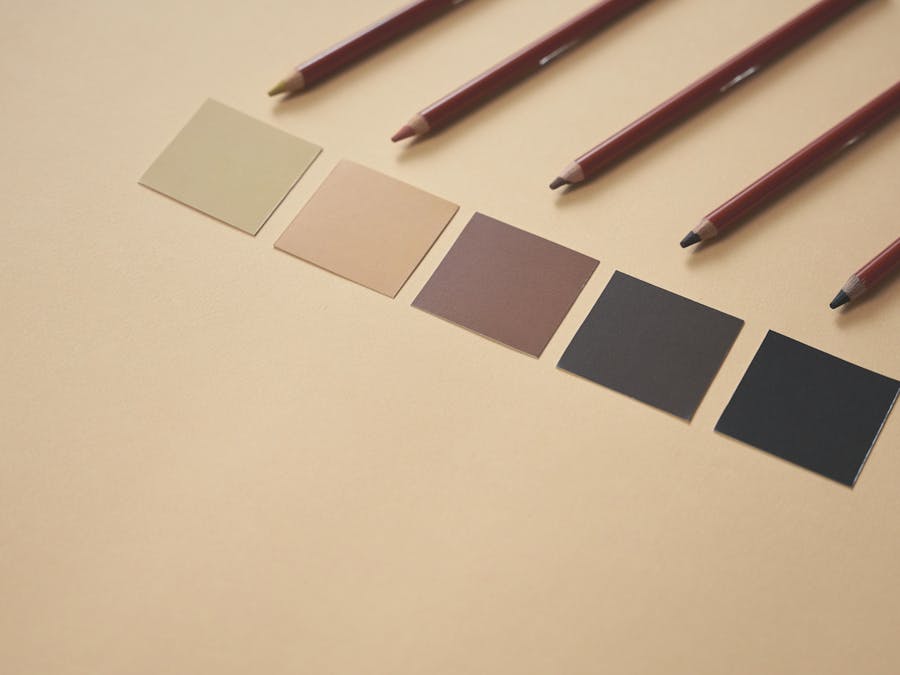
One of the most effective ways to create a cohesive Instagram feed is to stick with a consistent color palette. This doesn’t mean every post needs to be the same color, but having a set of colors that appear regularly creates visual harmony.
Start by thinking about the mood you want to convey. Bright, saturated colors feel energetic and fun. Muted, earthy tones feel calm and sophisticated. Black and white creates a timeless, artistic vibe. There’s no right or wrong choice—it depends on your personality and what resonates with your audience.
Look at your existing photos and notice which colors appear most often. Maybe you’re naturally drawn to warm sunset tones, or perhaps your wardrobe and surroundings feature lots of neutrals. Building on what already exists makes the process easier and more authentic.
Once you’ve identified your palette, try to incorporate those colors intentionally. This might mean choosing backgrounds, props, or outfits that fit your color scheme. It could also mean adjusting your editing to enhance certain tones while toning down others.
Editing apps like Lightroom or VSCO make it easy to maintain consistent color tones across all your photos. You can create custom presets that apply the same adjustments to every image, saving time while ensuring your feed looks unified.
Your color choices are also part of building a personal brand on Instagram. When people recognize your posts by their distinctive colors, you’ve created a visual identity that sets you apart from others in your niche.
Planning Your Content Mix
A great Instagram feed includes different types of content that work together. Posting the same style of photo repeatedly can become boring, but mixing things up keeps your audience engaged while maintaining your overall aesthetic.
Consider including a variety of content types in your feed. Portrait shots, landscape images, close-up details, and text-based graphics can all coexist beautifully when they share a consistent editing style or color palette. The key is finding the right balance for your brand.
Product-based accounts might alternate between lifestyle shots, product close-ups, and customer photos. Personal brands might mix selfies with quotes, behind-the-scenes moments, and curated images. Food accounts might combine overhead shots, side angles, and ingredient details.
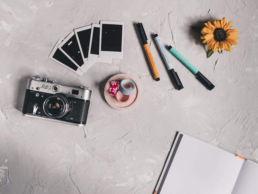
One popular content style that works well in curated feeds is flat lays. These overhead shots of carefully arranged items create visual interest and allow you to control every element in the frame. They’re particularly effective for showcasing products, creating mood boards, or telling a story through objects.
Planning ahead helps you see how different posts will look together before you publish them. Many creators plan their content weeks in advance, arranging posts to create pleasing patterns and ensure variety. Looking for seasonal content ideas can help you plan themed posts throughout the year that fit naturally into your feed.
Remember that your feed tells a story over time. Each new post becomes part of a larger visual narrative. Thinking about how individual posts contribute to the whole helps you make better decisions about what to share and when.
Creating Visual Consistency with Editing

Editing is where the magic happens. Even photos taken in different locations, lighting conditions, and times can look cohesive when edited with a consistent style.
Start by choosing an editing approach that suits your content. Some creators prefer bright, airy edits with lifted shadows and soft highlights. Others go for moody, dramatic looks with deep contrasts and rich colors. Some stick to clean, minimal adjustments that let the natural photo shine through.
Creating presets or saving your favorite editing settings allows you to apply the same adjustments to every photo quickly. This saves time and ensures consistency even when you’re editing on different days or in different moods.
Pay attention to specific elements like exposure, contrast, saturation, and white balance. Small adjustments to these settings can dramatically change how a photo feels. Keeping these adjustments consistent across posts creates that unified look that makes feeds feel intentional.
The concept of personal branding for students shows how consistent editing supports brand building at any stage. Whether you’re just starting out or have been posting for years, developing a signature editing style helps people recognize your content instantly.
Don’t be afraid to evolve your editing style over time. Many successful accounts have shifted their aesthetic gradually as their skills improved or their brand direction changed. The key is making changes slowly so your feed maintains some continuity.
Using Grid Layouts and Patterns
Beyond individual posts, the way your content arranges in the grid creates another layer of visual interest. Some creators use intentional patterns to make their feeds even more distinctive.
The row theme approach involves posting three related images that create a cohesive horizontal row. When someone scrolls through your profile, each row tells its own mini-story while contributing to the larger feed aesthetic.
Checkerboard patterns alternate between two types of content, like photos and quotes, or light and dark images. This creates a visually striking grid that’s easy to maintain once you establish the pattern.
Puzzle feeds take this concept further by splitting a larger image across multiple posts. When viewed on your profile, these posts combine to form one big picture. While visually impressive, puzzle feeds require careful planning and can be challenging to maintain long-term.
Looking at successful Instagram boutiques provides excellent examples of brands with well-organized grid layouts. These accounts often use consistent backgrounds, spacing, and composition to create feeds that feel like curated catalogs.
You don’t need to follow a strict pattern to have an attractive grid. Simply being aware of how your posts look together and occasionally adjusting your posting order can make a significant difference. Preview your grid before posting to see how new content will fit with existing posts.
Writing Captions That Match Your Visual Style
Your Instagram feed isn’t just about visuals. Captions play an important role in creating a complete brand experience. The way you write should complement the way your feed looks.
Think about the tone that matches your visual aesthetic. A bright, playful feed might pair well with casual, emoji-filled captions. A sophisticated, minimal feed might call for thoughtful, polished writing. A bold, edgy feed might suit direct, confident language.
Consistency in caption style helps reinforce your brand identity. This includes things like how you start your captions, whether you use emojis, how long your posts typically are, and what kind of calls to action you include.
Developing your writing style takes practice. Resources on creating a unique Instagram voice can help you find a caption style that feels authentic and connects with your audience.
When sharing research, statistics, or information from other sources in your captions, proper attribution matters. A free APA citation generator can help you format citations correctly when you need to credit sources in your content.
Your captions should add value beyond what the image shows. Share stories, ask questions, provide tips, or offer insights that give people a reason to read and engage. The best captions create conversation and connection.
Tools to Help You Plan Your Feed

Planning your Instagram feed becomes much easier with the right tools. Several apps let you preview how your grid will look before you post, helping you make better decisions about content order and timing.
Feed planning apps typically let you upload photos, arrange them in different orders, and see how they’ll appear on your profile. This visual preview helps you spot potential issues, like two similar photos ending up next to each other or a color that clashes with surrounding posts.
Many planning tools also include scheduling features, allowing you to prepare content in advance and post automatically at optimal times. This saves time and helps you maintain a consistent posting schedule without being tied to your phone.
Some creators prefer simple approaches, like creating a folder of upcoming posts and arranging them manually. Others use sophisticated tools with analytics, hashtag suggestions, and team collaboration features. The best tool is the one you’ll actually use consistently.
For brands looking to take their content planning further, using AI for Instagram marketing offers new possibilities for optimizing content strategy and understanding what resonates with your audience.
Whatever tools you choose, the goal is to make planning easier so you can focus on creating great content. Spending a few hours each week or month planning your feed pays off in a more cohesive, intentional-looking profile.
Turning Your Feed Into a Sales Channel
A well-curated Instagram feed does more than look pretty—it can drive real business results. When your feed creates a strong first impression, visitors are more likely to trust your brand and consider purchasing from you.
Your feed acts as a visual storefront. Just like a physical store arranges products to attract customers, your Instagram grid showcases what you offer in an appealing way. Every post is an opportunity to demonstrate your value and build desire for your products or services.
Consistency builds trust. When your feed looks professional and intentional, people perceive your brand as more credible. This perception translates into higher conversion rates when you promote products or services.
For those selling physical products, setting up Instagram shopping allows you to tag products directly in your posts. This creates a seamless path from discovery to purchase, turning your curated feed into an interactive catalog.
Even service-based businesses benefit from attractive feeds. A coach, consultant, or creative professional with a polished Instagram presence appears more established and trustworthy. Your feed becomes proof of your attention to detail and commitment to quality.
Balance promotional content with value-driven posts. Feeds that feel like constant advertisements turn people away. Mix product features with lifestyle content, tips, behind-the-scenes glimpses, and community engagement to keep your audience interested and connected.
Common Feed Mistakes to Avoid
Even with the best intentions, certain mistakes can undermine your feed’s appeal. Knowing what to avoid helps you maintain a scroll-worthy profile.
Inconsistent editing is one of the most common issues. When some photos are bright and others are dark, or when colors vary wildly from post to post, your feed looks disjointed. Stick to your editing style even when you’re tempted to try something different.
Posting without previewing often leads to regret. That photo might look great on its own but clash terribly with the posts around it. Always check how new content will fit into your existing grid before publishing.
Ignoring image quality hurts your feed’s overall appearance. Blurry, pixelated, or poorly lit photos stand out negatively, no matter how well they’re edited. Prioritize quality over quantity.
Over-editing can make photos look unnatural and dated. Heavy filters, extreme saturation, and obvious effects often age poorly. Subtle, timeless editing tends to hold up better over time.
Neglecting variety makes feeds feel monotonous. Even with consistent editing, you need different types of content to keep things interesting. Mix up your subjects, compositions, and content types.
Abandoning your aesthetic for trending content can disrupt your feed’s cohesion. While it’s fine to participate in trends occasionally, forcing content that doesn’t fit your style creates visual inconsistency.
Posting too frequently or infrequently affects how your feed develops. Posting multiple times daily can overwhelm your grid with similar content, while posting rarely makes it hard to build momentum and maintain consistency.
Forgetting about the big picture leads to feeds that lack direction. Each post should contribute to your overall visual story. Step back regularly to assess how your feed looks as a whole, not just individual posts.
Building a scroll-worthy Instagram feed takes time and intention, but the results are worth the effort. When your profile looks cohesive and inviting, people stay longer, engage more, and remember you. Start with small changes, stay consistent, and watch your feed transform into something people genuinely want to scroll through.