

Instagram isn’t just a place for pretty pictures—it’s a visual platform that runs on psychology. Whether you’re a creator, business owner, or casual user, how your posts look influences how people feel about your content, how long they engage with it, and whether they follow you.
This article explores how aesthetics shape perception, why certain colors and layouts matter, and how you can use psychological principles to create an Instagram presence that feels cohesive, trustworthy, and memorable.
Why Visuals Matter More Than You Think
The Instagram algorithm moves fast. Before anyone reads your caption or checks your bio, they form an impression based on your visual style. What they see in your posts, layout, and Stories determines whether they stick around.
Visuals impact:
- How trustworthy you appear
- Whether your message is understood
- How likely someone is to follow or engage
- How memorable your presence becomes
Since people process images faster than text, your aesthetic does more than please the eye—it communicates value at a glance.
Understanding Aesthetic Psychology
When people talk about Instagram aesthetics, they usually mean filters and layouts. But there’s a deeper layer: how people emotionally respond to what they see. That’s where psychology meets design.
Some of the core principles include:
- Symmetry feels satisfying and calm
- Color evokes emotional states
- Repetition builds familiarity and comfort
- Simplicity communicates professionalism
- High contrast captures attention
Color Psychology on Instagram
Color is one of the most powerful psychological tools in your Instagram toolkit. It’s not just about looking good—it’s about creating a mood that aligns with your message.
For instance:
- Blue is often linked to calm, trust, and logic. This could explain why it’s considered the world’s favorite color in multiple studies.
- Red conveys urgency or excitement—helpful for getting attention
- Green connects with health and calm
- Black and white offer a minimalist or bold edge
No matter your theme, picking a consistent palette allows followers to recognize your content even before they see your name.
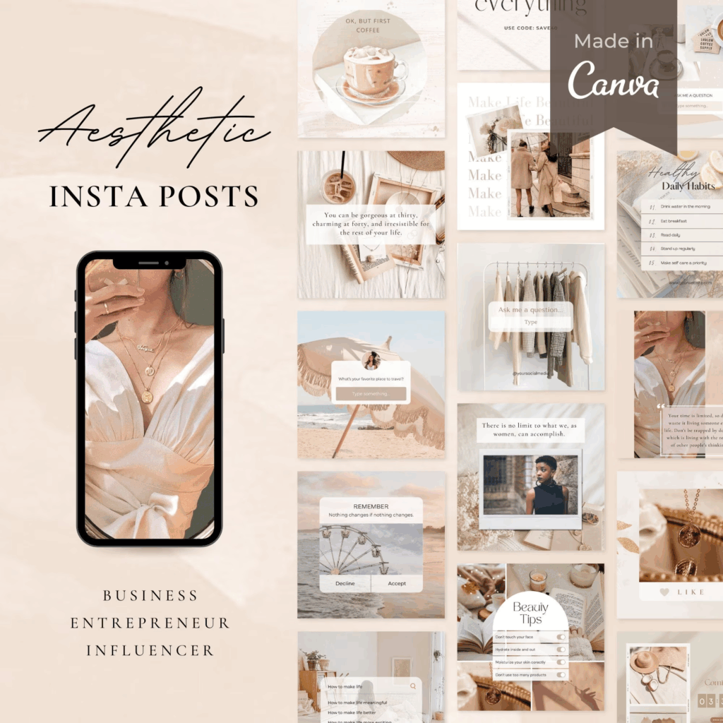
Layout and Grid Strategy
Your Instagram feed is your storefront. If it’s messy, disconnected, or noisy, people may not feel inclined to explore. But a clean, intentional grid keeps visitors engaged and gives them a sense of who you are.
If your layout has become inconsistent, take a step back and assess the big picture. Understanding how the Instagram Feed has evolved over time can help you make better decisions about what kind of content to prioritize and where to place it on your grid.
Tips for layout design:
- Alternate light and dark backgrounds
- Use white space to create breathing room
- Keep fonts and filters consistent
- Stick to visual patterns like 3-photo rows or checkerboards
These small choices build a visual rhythm that supports your message.
Fonts and Typography
Text plays a quiet but essential role in your visuals. Fonts convey tone—and certain styles carry subconscious meaning. Clean, bold fonts can express confidence. Handwritten scripts might signal approachability. But too many fonts can feel chaotic.
The art of arranging fonts in a way that enhances your design is called typography, and it matters even on social platforms.
Font best practices for Instagram:
- Stick to one or two consistent typefaces
- Use legible fonts for longer captions or carousels
- Let bold or italic styles do the heavy lifting for emphasis
- Avoid layering too many text styles in one design
Strong typography guides the viewer’s eye and adds clarity to your visuals without needing elaborate designs.
The Role of White Space
White space—also known as negative space—is the empty area around text, images, or elements in your design. It may seem like wasted space, but it actually helps highlight what matters.
Psychologically, white space gives the eye room to rest. It creates a feeling of calm, cleanliness, and focus. That’s why minimalist pages often feel elegant and polished, even with very simple posts.
You can apply white space by:
- Not overcrowding text in carousels
- Leaving space between elements in Reels or infographics
- Avoiding too many stickers or GIFs in Stories
Less visual clutter means more clarity—and a better chance your message gets across.
Emotional Aesthetics: How You Make People Feel
The best Instagram pages don’t just look good—they make you feel something. Emotion plays a big role in how people engage with content and decide whether to follow or return.
Ask yourself:
- Do your colors evoke the feeling you want to share?
- Does your content feel inviting, inspiring, or calming?
- Is there a consistent tone across your visuals and captions?
Some accounts like @ritual are great examples of using emotional tone and consistent visual language to build trust and relatability through content. Even simple layouts feel intentional when supported by strong emotional aesthetics.
Curating vs. Creating
Many people assume they need a professional camera or editing software to have a great aesthetic. That’s not true. A big part of aesthetics is curating—making thoughtful decisions about what to include, how to crop photos, and how to keep things consistent.
Some tips:
- Use natural light whenever possible
- Shoot from similar angles to maintain flow
- Stick to a preset or filter that matches your vibe
- Edit on your phone with tools like Canva or Lightroom Mobile
Influencers like @taramilktea often curate their feeds in a way that tells a cohesive story. It’s not about having professional tools—it’s about being thoughtful and intentional with each post.
Templates and Repeatable Formats
If you want to simplify your aesthetic while still looking polished, templates can help. Having 2–3 post formats you rotate through makes your feed more consistent—and content creation faster.
Examples:
- Carousel template for tips or reflections
- Reel template with title text and music
- Static post with quote + your brand color background
Templates help reduce the mental load of design while reinforcing your style. Once you’ve created a few, reuse them with fresh content each week.
And don’t forget the value of strong captions. Posts that include clear calls-to-action (CTAs) tend to perform better. Ask your audience to save the post, share it with a friend, or comment with their take. These simple prompts can significantly boost engagement.
Aesthetic Doesn’t Mean Shallow
Sometimes people assume that focusing on Instagram aesthetics is superficial. But visual content is how we communicate without words. A strong aesthetic isn’t about vanity—it’s about clarity, storytelling, and building trust.
If your content is valuable, don’t let weak visuals get in the way. A better aesthetic helps people actually see, understand, and connect with what you have to offer.
This reflects what the Psychology of art teaches us: visuals are not just decoration. They’re part of how we understand, remember, and emotionally process what we see.
Bulletproof Your Aesthetic Strategy
Here are a few ways to make sure your aesthetic works even when you’re busy:
- Use a consistent set of 3–5 colors
- Create a Highlights strategy with uniform covers
- Batch content once a week to maintain quality
- Build a small library of graphics and fonts you always use
- Revisit your feed monthly to check visual flow
It doesn’t take hours a day. With a few systems in place, your page can look polished and purposeful—without constant design work.
Aesthetics and the Instagram Algorithm
Instagram’s algorithm favors engagement—but visuals still matter. Aesthetic posts are more likely to get saved, shared, and commented on. That boosts their performance in Explore and Reels tabs.
A strong aesthetic doesn’t guarantee growth, but it increases your chances of standing out and making an impression.
Consistency builds recognition. Recognition builds trust. And trust builds engagement.
Testing and Evolving Your Visual Style
No aesthetic needs to be permanent. One of the most valuable things you can do is experiment. Just like your content or niche might shift over time, your visuals should adapt as well.
It’s okay to start with a basic grid layout or minimal filter and slowly test new formats, palettes, or templates. Not only does this keep things creatively interesting for you—it also shows your audience that your content is growing with intention.
Start with small tests:
- Try one new filter across a few posts
- Introduce a new layout style in carousels
- Switch your cover image design on Reels
- Test white space vs. full-bleed images
Let each change run for a few weeks before deciding whether to stick with it or revise. If engagement improves and your audience responds well, you’ll know you’re headed in the right direction.
Use Insights to Guide Visual Decisions
While creativity plays a big role in aesthetics, data can support your design choices. Instagram Insights provides a look at how different content performs over time. When you post two carousels with different layouts or two Reels with different tones, compare their:
- Saves and shares
- Reach and impressions
- Time viewed (especially in video content)
These numbers tell you what’s resonating visually. You might find that warm tones or minimal designs perform better—or that certain text overlays get more shares. The more you learn from performance, the more you can refine your visual identity.
Staying flexible while using data to shape your design approach leads to stronger content that evolves with your audience—without losing visual cohesion.
Final Thoughts
Instagram aesthetics aren’t about being perfect—they’re about being intentional. When you understand the psychology behind colors, layout, white space, and emotional design, you can make smarter choices that help your content resonate.
Even small adjustments—like choosing one consistent filter or using more space in your designs—can make a big difference in how people perceive and engage with your posts.
Your aesthetic is the silent introduction to everything you have to say. Make it count.